Why The Beautiful Line?
A site dedicated to the art of drawing and painting, The Beautiful Line is an open forum for the sharing of information and inspiration about the drawing and rendering process in digital and traditional media.
This blog is created for all those who share a love of drawing and are enticed by the potential of a blank piece of paper, canvas, or board to create a unique work of art. This space is dedicated to the open sharing of information and experiences concerning drawing. Included here are tutorials on drawing and rendering a variety of subjects in easily accessible media.
Why the Beautiful Line? As a long time professional illustrator, artist, and instructor, I still believe that the most powerful tool for image making is the simple pencil, pen, or brush. In an era of fantastic advances in digital arts with the power to create new worlds of amazing realism, the pencil drawing remains an exquisitely elegant tool for expressing thoughts and ideas. With this in mind, I view it as a personal mission as an instructor to encourage students to draw their ideas first, before developing concepts within a software program.
Tuesday, April 15, 2014
Hermione Granger Montage
RUPERT GRINT: Digital Painting
RUPERT GRINT
Another view of Rupert Grint as Ron Weasley. This painting features a rusted door texture and a burlap pattern imbedded into the background paint strokes.
Harry Potter: Severus Snape
Severus Snape: Digital Portrait
I am hunting for unusual photos of the Harry Potter characters that feature strange lighting or interesting expressions. This painting emerged from a low resolution image with Snape in very low light. The hints of cool toneson his face were translated into a blue, green, lavender, and black palette of paint strokes. It took a while to bring him into focus, but I like the final result. The expression on his face and the colors seem to reflect the conflicted nature of his character.
Harry Potter: Ron Weasley Digital Portrait
Just finished this week's portrait. I am finishing up a set of paintings of the Harry Potter characters this month. They have made great subjects for practicing painting techniques. I have been studying the work of various portrait and landscape artists like Jeremy Mann and Jeremy Watts who have very energetic approaches to building color on the canvas. These fine artists are teaching me a lot about getting loose with brush strokes and maintaining an impressionistic attitude toward the subject.
This painting took about 10 hours. 2 years ago if I attempted this it would have taken 20-30 hours and would not have been as strong as a painting. Starting loose and staying loose as long as possible is a big advantage in completing paintings more quickly.
Chrysler CEO Sergio Marchionne
This painted montage of portraits of Chrysler CEO Sergio Marchionne was actually assembled as an idea for a portrait study in the summer of 2012 when I was working only in vector. The plan was to do a painting in acrylics. I picked up the rough comp in 2013 and created this finished illustration. The goal was to convey his dynamic personality and the non-stop nature of his daily life as the head of both Fiat and Chrysler.
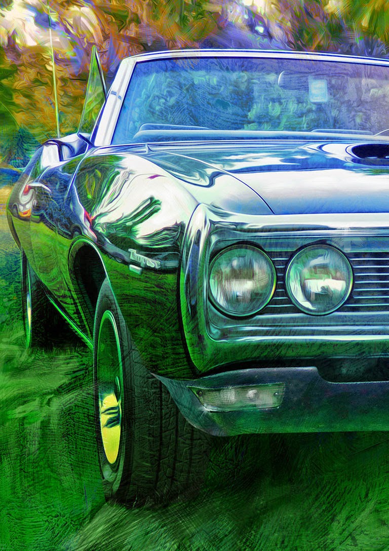
Digital Painting: 1968 Pontiac Tempest
1968 PONTIAC TEMPEST

Digital Painting: Auburn 8 120 Boat-Tail Speedster
1929 AUBURN 8 120 BOAT-TAIL SPEEDSTER
Digital Painting: 1965 Pontiac Tempest GTO
1965 PONTIAC TEMPEST GTO
Just finished the next painting in my American Muscle Cars series. I am exploring different levels of simplicity in the backgrounds. This painting is the first to include actual textures made by me with gesso and modeling paste.
Digital Painting: 1971 Buick Riviera 1
1971 BUICK RIVIERA
This high view is another angle of the same Buick Riviera rear view already posted. I was experimenting with an overlay of a watercolor wash when this quite meditative looking image emerged. I like to emphasize the lines of the car in my paintings much as the catalogue shots did back in the 1970s.
Digital Painting: 1971 Buick Riviera 2
1971 BUICK RIVIERA
This Classic Riviera with the huge wing shaped rear bumper filled my camera's image area when I snapped a picture at the Woodward Dream Cruise. Detroit loved chrome, and so do I as a an artist. I am working on paintings from several angles for this car. Amazingly, I almost passed it up as a subject but turned around and walked back to take a few pictures.
Digital Painting: 1967 Pontiac GTO
1967 PONTIAC GTO
Digital Painting: Buick Estate Wagon
1946 BUICK ESTATE WAGON
I am working on a series of car paintings based on selected photos I have taken over the last several years. I am thinking of marketing them at shows along with paintings of Detroit area landmarks. My goal is to achieve a fully painted look using Photoshop and Painter. This painting was created as a mixture of painted strokes and filters. I hope the effect will be of a timeless moment where sun and shadow have combined beautifully.
Wednesday, January 6, 2010
Inking With Fine Tip Pens: Civil War Generals
General Joseph Hooker
Some important stylistic influences in these portraits are the work of illustrators like Barron Storey, Max Altekruse, and Gary Kelly. I owe much to Detroit area artist Max Altekruse, who I had the pleasure of working with at McNamara Associates from 1981 to 1995. Max is one of the great classically trained illustrators still working. He trained at the New York Artist's League more than 45 years ago and is skillful at making every corner of an illustration fascinating to look at.
The details in the faces of these illustrations are formed from abstracted shapes. The nose on General McClellan, for example, is treated like an elongated cube shape and is defined by distinct edges. Finding edges, even in the subtle contours of the cheeks, gives definition to the face and creates opportunities to accentuate the style of the strokes. This is a fundamental lesson I learned from studying the works of great illustrators like those mentioned above.
Almost anyone can render a face and create a likeness, but top level illustrators can bring out a unique stylistic quality that makes their work easy to identify. A great example of this is the poster illustration of Drew Struzan. Visualize the Indiana Jones poster artwork and you will get an idea of what I am talking about.
Tuesday, January 5, 2010
Preparatory Sketch for General Sherman Portrait
I am always trying to indicate the feeling of brush strokes, even in my drawing. For me, drawing should be like writing my signature: fluid, natural, and expressive of a personal style.
Monday, January 4, 2010
Emphasizing the Brush Stroke
Saturday, January 2, 2010
Working Loose With Markers: Faster Can be Better


To create the final art, I added color to each of the drawings in Photoshop as shown below. The line art was scanned at 300 dpi and imported into Photoshop as a transparent layer. A heavily textured acrylic painted background was also imported into Photoshop, along with fragments of images and a wallpaper pattern.
Finding Abstract Shapes: 1956 Buick 88
Working With Markers: Jimi Hendrix Portrait
"What is Cool?", detailWhen is it effective to "block in" an area?
I found it better to create large totally black areas in parts of this illustration. The reason for this was the high amount of complex textures in the photo. Too much information tires the eye and creates an overall busy appearance. Dropping out some areas like the shadow on the neck was a good idea here. However, the hair still has diagonal shards of white that I left intentionally to break up this shape.
Why the two different approaches?
The mass of the hair was too large a shape to simply render in solid black. Plus, the hair needs to appear light and "frizzy" as it is in the photo. My solution was to give the whole image more dynamic thrust by leaving diagonal areas of white in the hair and on darker shadow portions of the body, as well as the background. This becomes a unifying stylistic theme that pulls the whole illustration together. The verticality of these strokes makes the figure look more animated, always a good quality when trying to create a lifelike portrait.
Translating Your Drawing Style Into Paint

As you can see in the detail above the pencil sketch still shows through in places. This is the result of a conscious decision to work in a semi-transparent mode throughout the painting. I used very little water in mixing my paints and relied on matte medium instead. I thinned the paint to the consistency of melting butter, working up from a base of raw sienna by adding basic shadows first and finishing with semi opaque tones for highlights.
Detailed work in the face required switching down to a quarter inch flat brush. This is the smallest size brush I allowed myself to use, and I refused to use any rounds for portrait. Why avoid rounds? I find that these pointed brushes lure me into rendering details too soon and tend to cause me to tighten up as I paint. The whole point is to stay loose from beginning to end, while finding ways to hint at details rather than render them out.